|

Ler "Conseils pour Faire un Bon Poster Scientifique" par Fabrice DUPRAT (juillet 2001)
Recomendações para elaborar um Pôster e comunicar
Consultar recomendações de Ana Luisa Pedro, ANCI 2008
* The poster presentation should cover the subjects described with the abstract.
* Place the title of your paper and your paper number prominently at the top of the poster board to allow viewers to identify your paper. Indicate 1) the abstract's presentation number, 2) title, and 3) authors' names.
* Highlight the authors' names, e-mails, and address information in case the viewer is interested in contacting you for additional information.
* Prepare all diagrams or charts neatly and legibly beforehand in a size sufficient to be read at a distance of 2 meters. Paragraph and figure caption text should be AT LEAST 24-point font (0.9 cm height) and headers AT LEAST 36 point font (1.2 cm height). Use creativity by using different font sizes and styles, perhaps even color.
* Use different colors and textures/symbols for each line or bar contained in your graph or chart. A serif font (e.g., Times) is often easier for reading main text, and a non-serif font (e.g., Arial or Helvetica) for headers and figure labels.
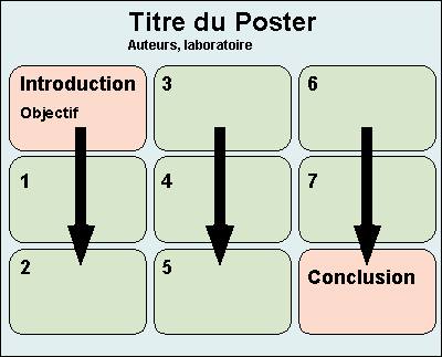
* Organize the paper on the poster board in a clear, orderly, and self-explanatory manner. You have complete freedom in displaying your information in figures, tables, text, photographs, etc.
* Use squares, rectangles, circles, etc., to group related ideas. Avoid cluttering up your poster with too much text. Label different elements as I, II, III; or 1, 2, 3; or A, B, C, making it easier for a viewer to follow your display.
* Include the background of your research followed by results and conclusions.
A successful poster presentation depends on how well you convey information
to an interested audience.
| Ultima alteração : 06/05/2021 |
| Webmaster : Jean-Claude REGNIER |
| Responsable scientifique : Jean-Claude REGNIER |
| Conception du logotype ASI7 : Vladimir LIRA VERAS XAVIER DE ANDRADE |
| Visiteur : |